Typography

Primary Typeface
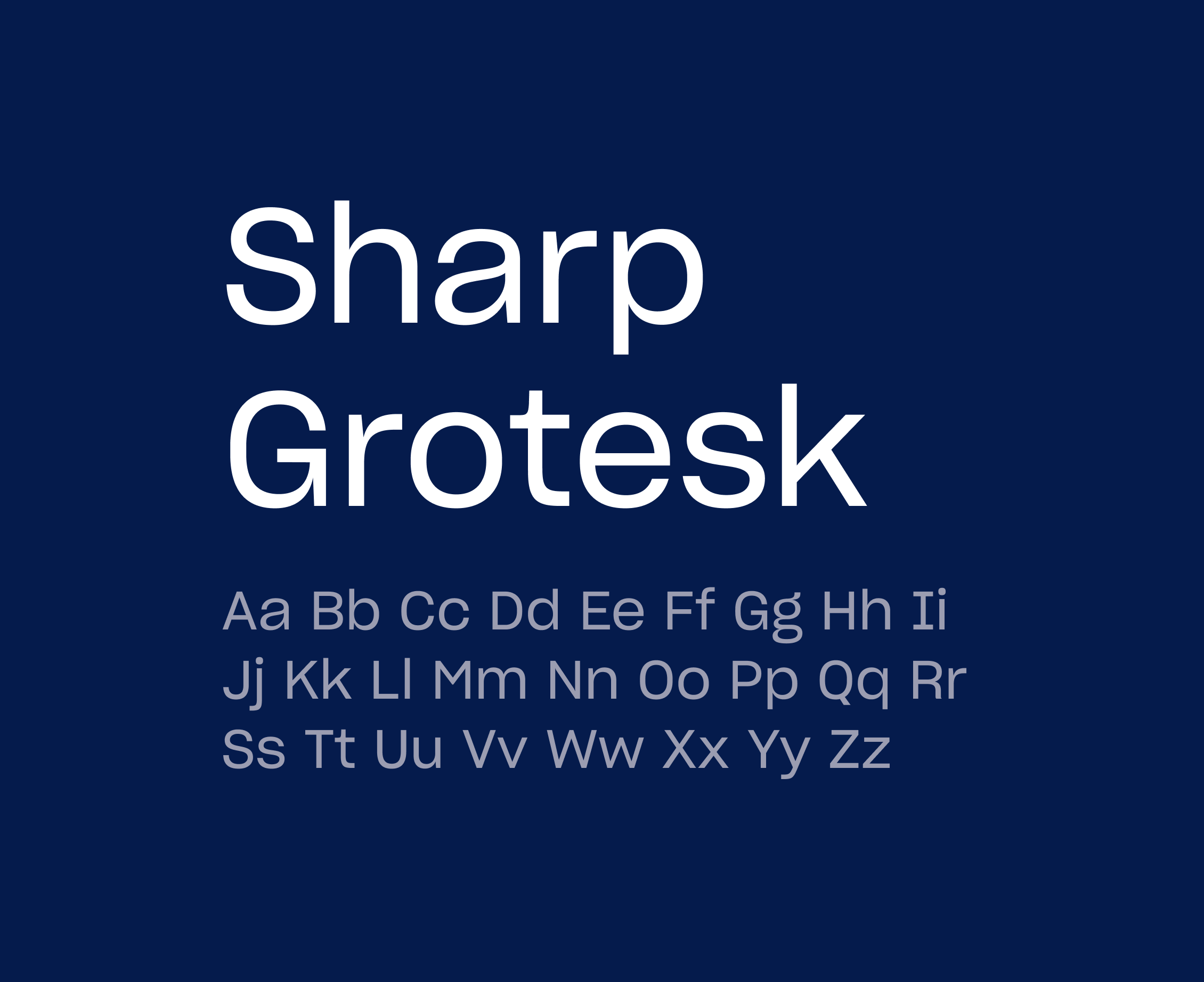
Sharp Grotesk 20 is the primary typeface for Echo’s brand and should be used for headlines and subheadlines. Use this custom font family whenever possible throughout our marketing and brand assets. Sharp Grotesk 20 is available in a variety of weights and widths, but Book and Medium should be used most frequently to create consistency.
Weights
- Regular
- Medium
- Bold
Secondary Typeface
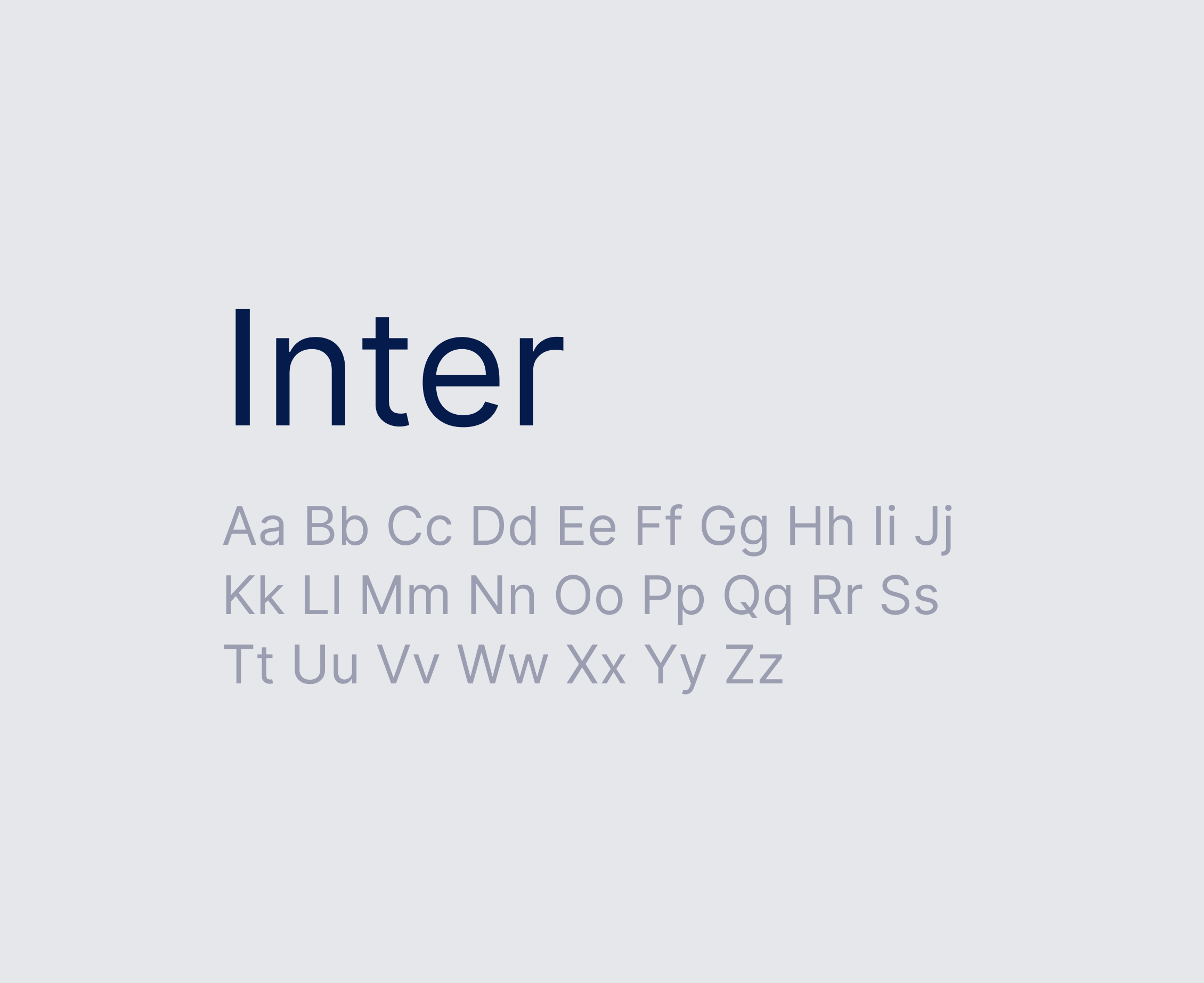
Inter is the Echo’s secondary typeface and should be used for all paragraph text and breadcrumbs. Use this custom font family whenever possible throughout our marketing and brand assets. Inter is available in a variety of weights and widths, but Regular and Medium should be used most frequently to create consistency.
Weights
- Regular
- Medium
- Bold
System Alternate
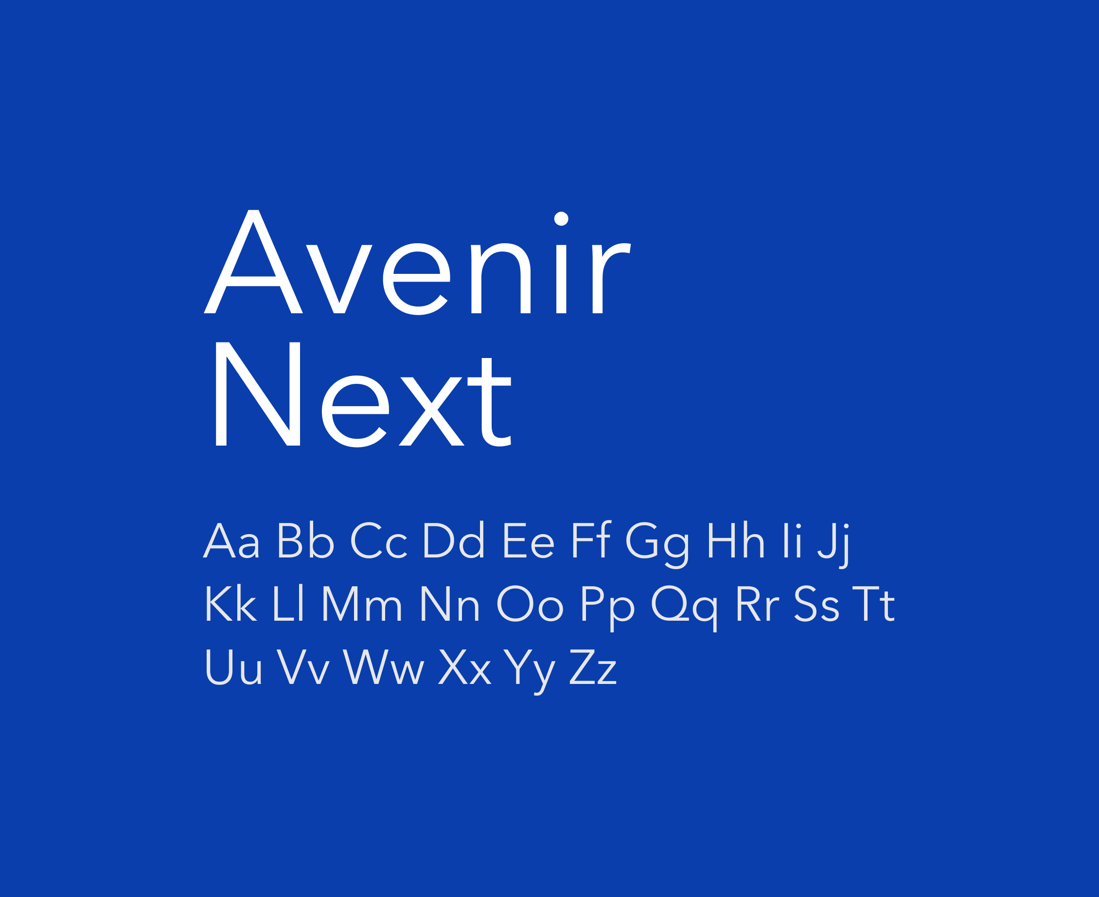
Avenir Next may be substituted in instances when Sharp Grotesk 20 or Inter are unavailable for all users or viewers. Such instances most commonly occur in shared documents, such as digital experiences like email.
Weights
- Regular
- Medium
- Bold
Hierarchy
Typeface hierarchy communicates importance, guides a reader’s eye, and clearly organizes and prioritizes content. Follow these guidelines to create the correct hierarchy and visual balance among the various instances of type in your designs and content documents.
Tag
Casing: Title
Font: Sharp Grotesk
Letter Spacing: 0px
Line height: 120%
Lorem ipsum dolor consecture
H1
Casing: Title
Font: Sharp Grotesk
Letter Spacing: 0px
Line height: 130%
Technology at Your Fingertips. Experts by Your Side.
H2
Casing: Title
Font: Sharp Grotesk
Letter Spacing: 0px
Line height: 130%
Innovative Tech Driving Your Business Forward
H3
Casing: Sentence
Font: Sharp Grotesk
Letter Spacing: 0px
Line height: 120%
Your strategic partner for any shipping need
Paragraph
Casing: Sentence
Font: Inter
Letter Spacing: 0px
Line height: 130%
Whether you need full transportation management services or point solutions, Echo serves as an extension of your team, connecting you to reliable capacity.
Button
Casing: Title
Font: Inter
Letter Spacing: 0px
Line height: 120%
Learn More
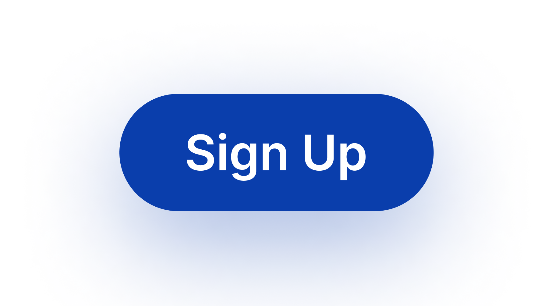
Primary Button Style
Creating a reliable, consistent customer experience is key to building trust and driving engagement. Using a consistent button style is an important part of this. Wherever possible, the following style should be used.
Active State

Hover State

Secondary Button Style
Using a consistent secondary button style is an important part of building brand equity. Wherever possible, the following style should be used.
Active State

Hover State
Tertiary Button Style
Using a consistent tertiary button style is an important way to unify information and guide user interaction. Wherever possible, the following style should be used.
Active State

Hover State